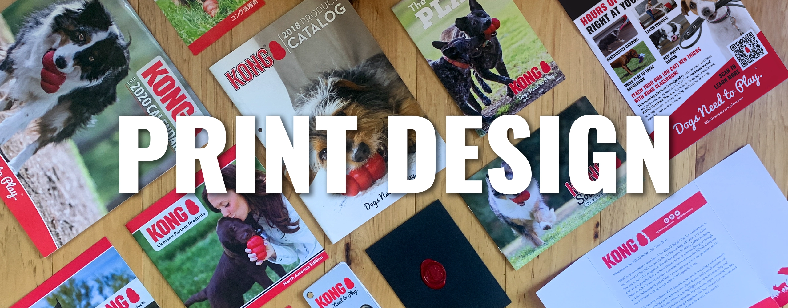
While there is print design throughout this website, this page features various print design and branding projects that I been a part of, primarily in my roles at KONG Company, as it is the most recent and most notable work.
The work below is no anywhere close to everything that I have either designed, or creative directed over the years. However, this is more of a sample of some of the various projects and the variety of work that I have been involved in.
CATALOG DESIGN & LAYOUT
Global Catalog Reformat & Design
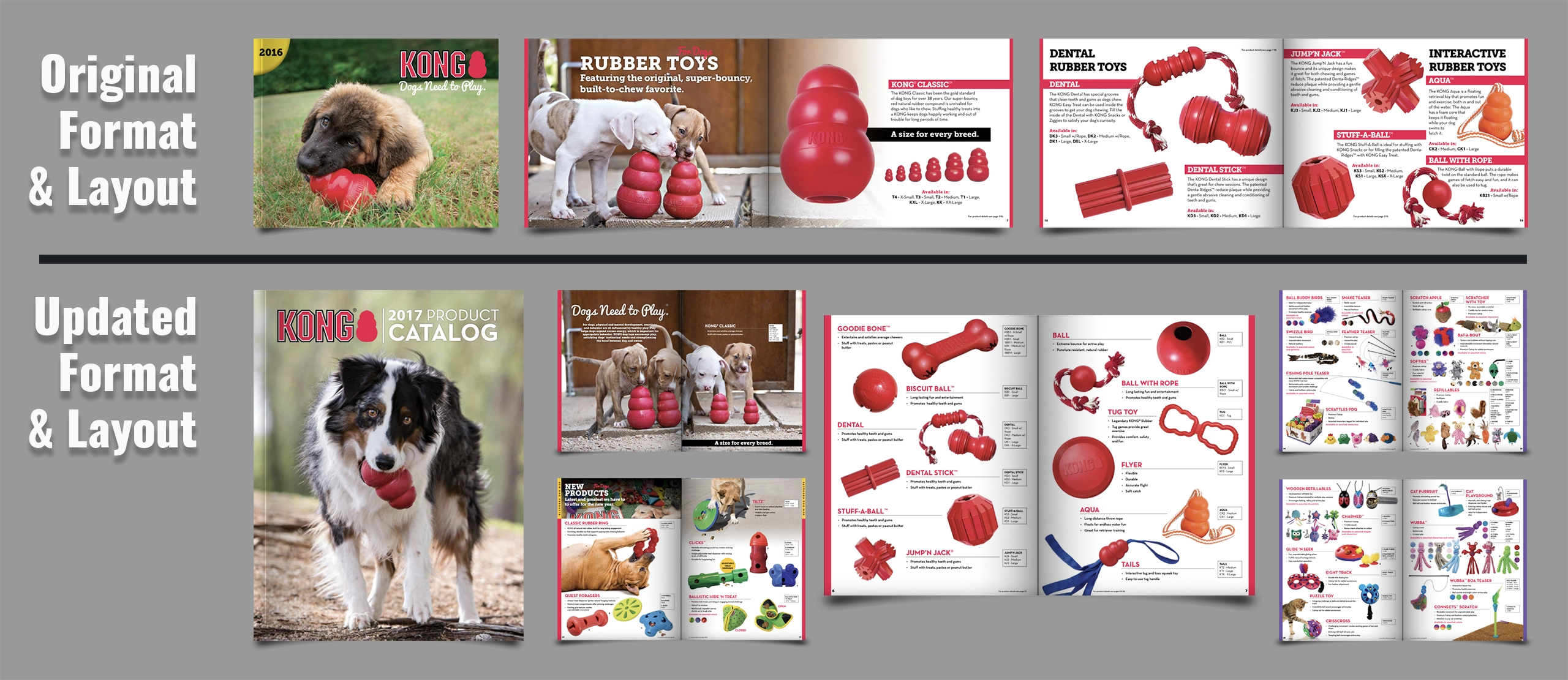
Between the 2016 and 2017 sales seasons, the number of products offered by KONG was growing to the point that the current catalog format was no longer going to work. The number of pages to continue that format was getting to a point where it was no longer cost effective and the length would be hard to hold the customer’s attention through the entire booklet. Therefore, I was tasked with coming up with a new format, layout & overall design of the catalog.
I started by changing the orientation from landscape to portrait, making it look like a more traditional catalog. From there I came up with a new layout, that allowed for less text (product bullet points, instead of romance copy), more products per page and a clean way to show the sizing and item codes in a predictable place for ease of ordering. By doing those 3 things, I was able to shave approximately 50 pages off of the end result. Saving on cost, and producing an easier to use sales and marketing tool. I addition, I included a new products section, to help facilitate sales to those customers that only wanted to see new products.
This format is still in use, as I handed over the design to one of my designers and creative directed the layout and design.
Japanese Product Catalog
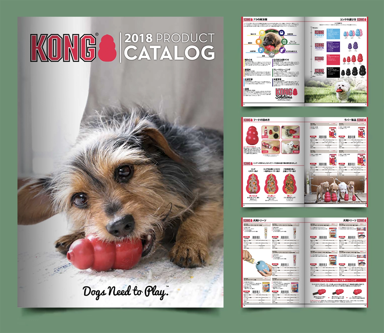
The catalog for the Japanese market is different than the catalog for the rest of the world. The catalog is of course in Japanese, but the largest difference is the structure. The market requires more structure and information that the rest of the world. As you can see in the pages, it is a grid of 6 products per page, and every product has a layout of information that is identical to the next. Another noticeable thing is that the product name and the information is the emphasis. Where the other catalogs on this page have the product as the star of the listing.
The Japanese market is very exacting and their attention to detail is unparalleled to other markets. Learning to design is Japanese has it own challenges, but once I learned the needs, I was able to produce a catalog what worked extremely well for the sales team.
ADVERTISEMENTS
KONG Classroom
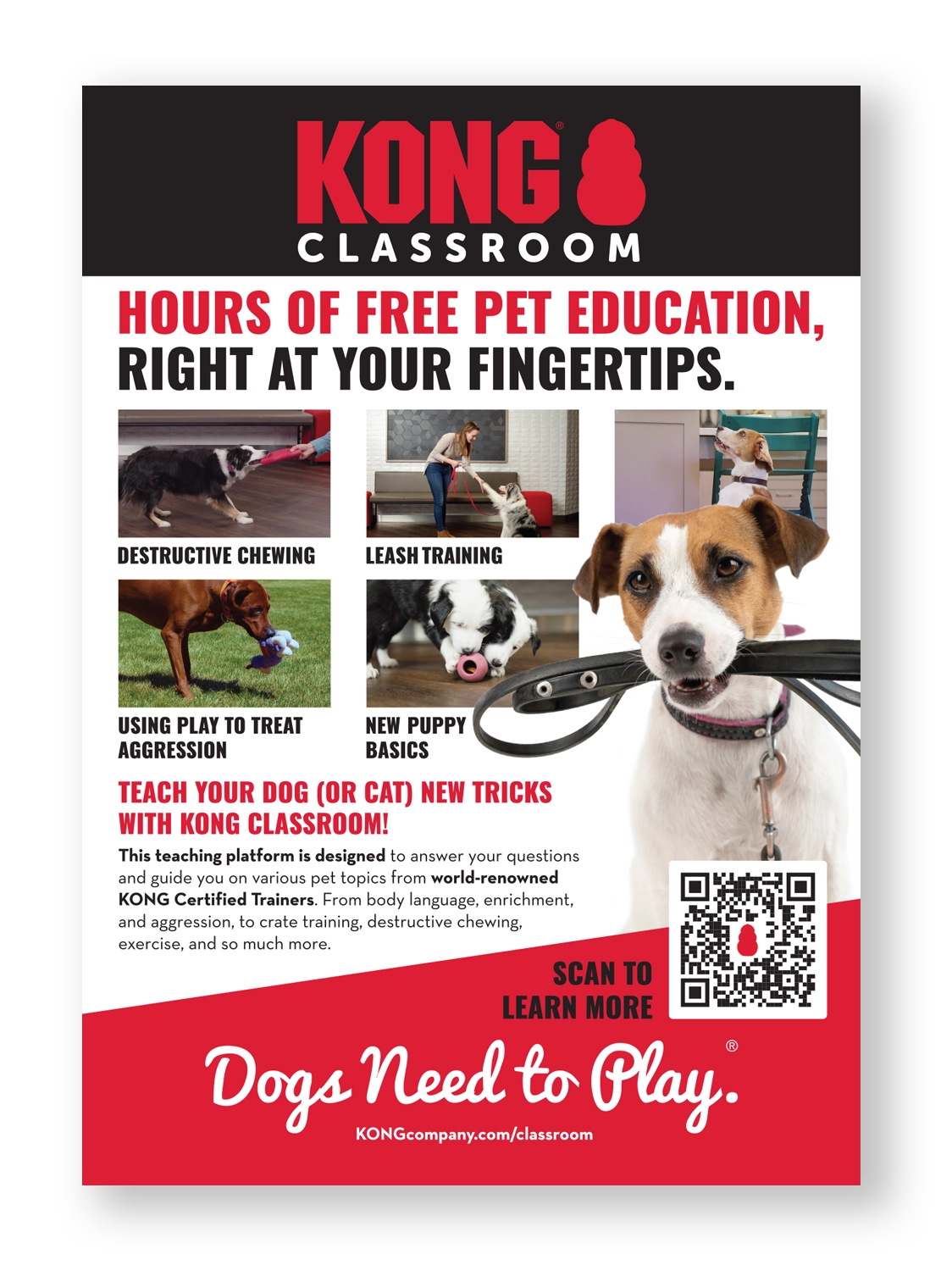
This advertisement was created to fulfill a need to get the new KONG Classroom program out to the world. The advertisement above was part of a series of applications to present Classroom to the world. (Another was a tradeshow booth application.) This ad mimics the look of the program on the KONGcompany.com site. In addition, I utilized the dog with the leash to have an eye catching visual to capture your attention and to make you want to read more. The QR code was included to give the viewer and easy way to get to the program.
Distributor (Editable)
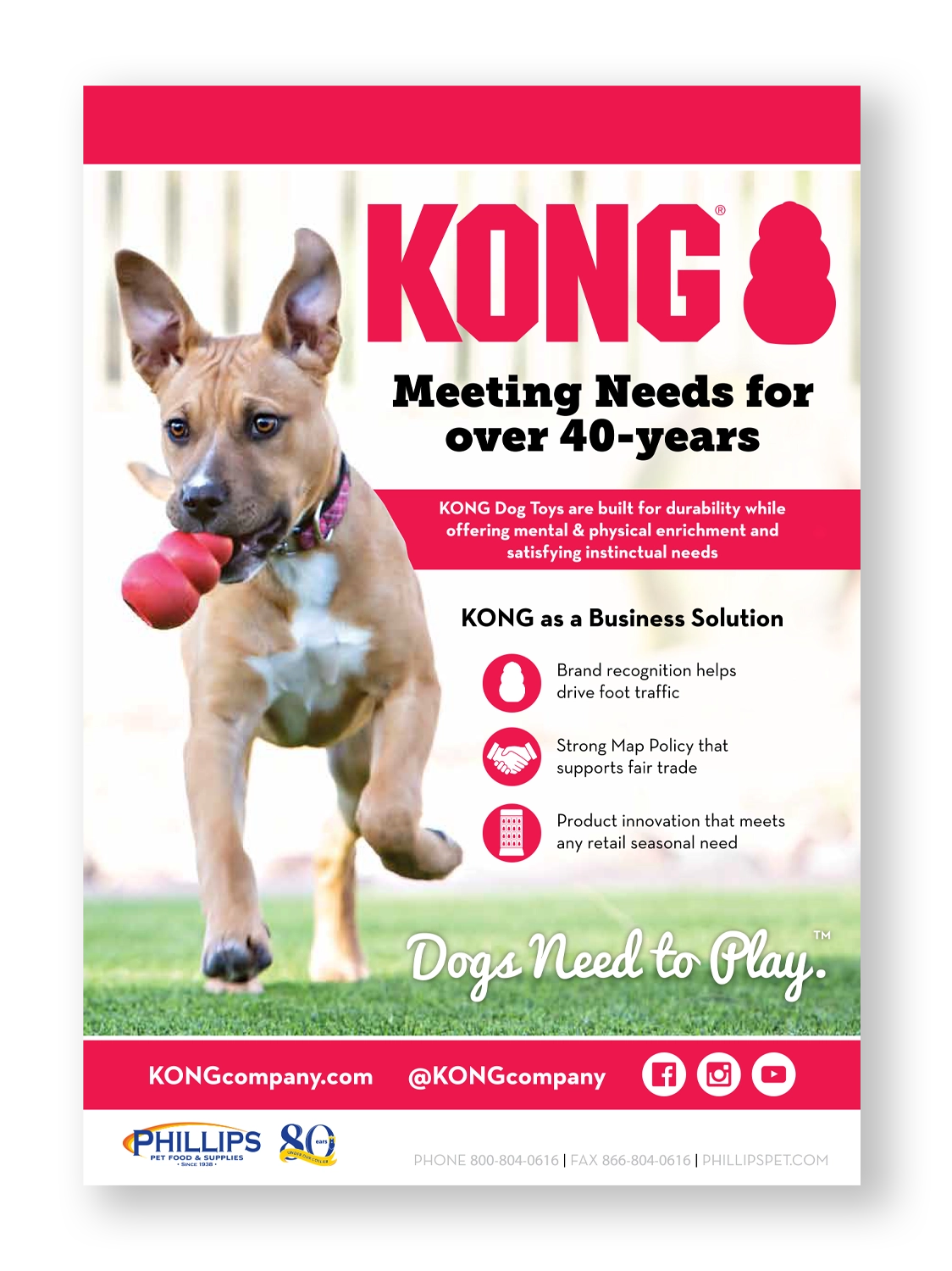
Working with distributors can be a challenge when it comes to keeping their sales tools on brand. In order to help with this challenge, I created a series of advertisements that made it easy for the distributor to add in their logo and contact info, without having to design the ad on their own. This advertisement was used to help let the stores know what KONG as brand and company can do for them, and ultimately drive sales for the distributor and ultimately KONG Company as a whole.
PRODUCT EDUCATION
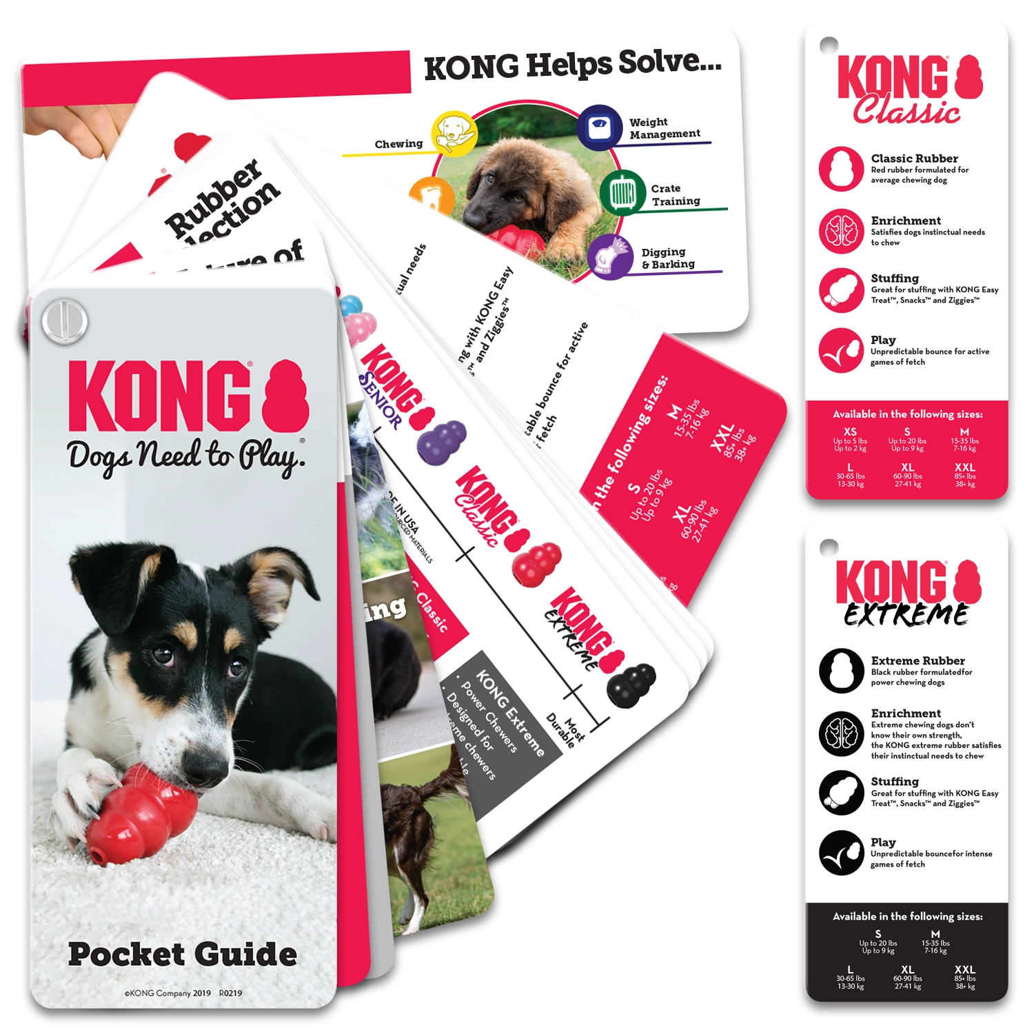
Pocket Education Guide
I created this educational tool in order to help in store associates have easy access to information while talking to customers about the flagship KONG products. Inside of this piece, I have included basic education on why dogs need to play, sizing, rubber strength and the benefits of the toys. It is the perfect size to fit into their pocket, printed on a thick, glossy card stock and held together with a Chicago screw.
SPECIALITY ITEMS
Japanese Business Cards
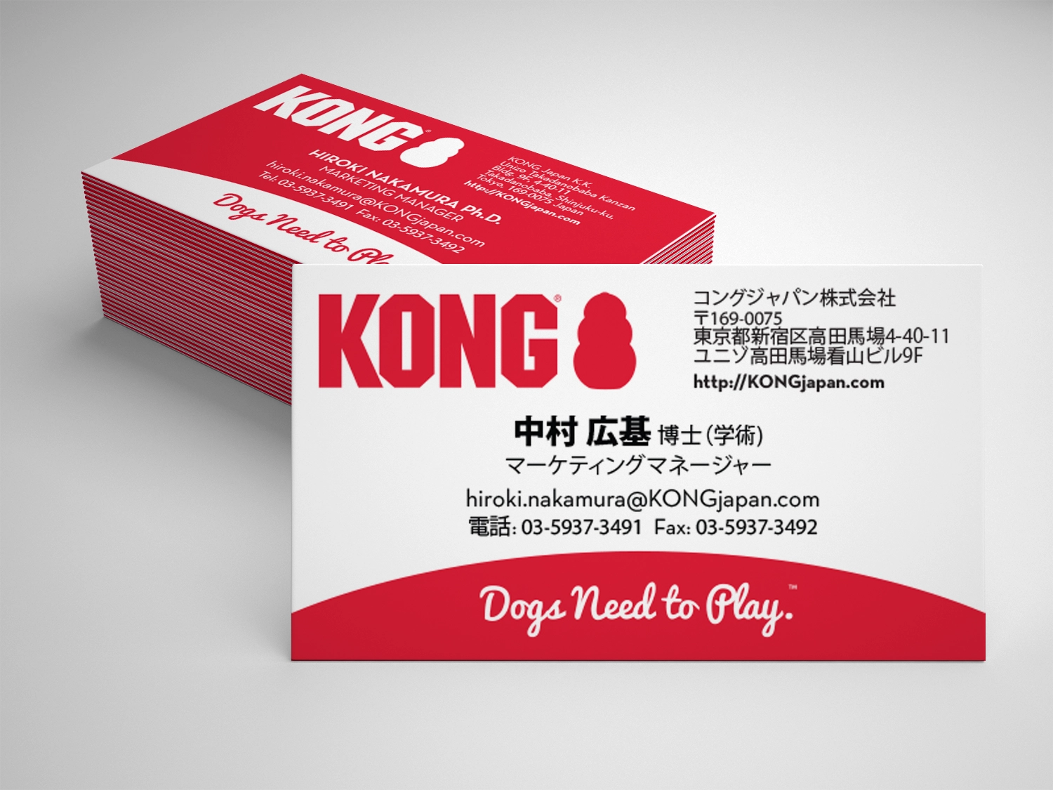
The business card needs for an American company in Japan, is that they need to be in both Japanese and English. The Japanese side is a carbon copy of the company cards in the rest of the world, only in Japanese. In order to solve for the less common English side of the card, I reversed the colors, creating a dynamic card and easy recognition of which side should be presented, based on whom is receiving the card.
KONG Ambassador Invitation
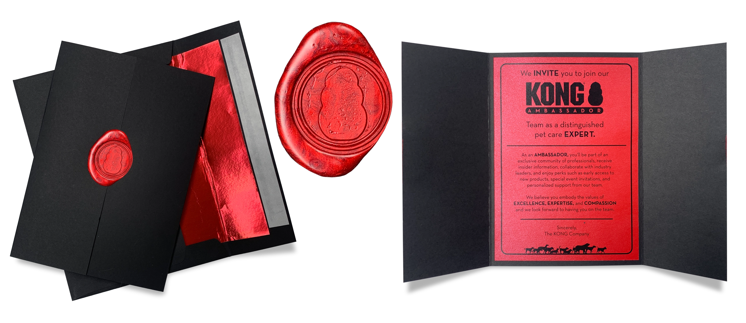
It is a special honor for an expert in the pet field to be invited to be part of the KONG Ambassador program. In fact, only a handful of experts are asked to join the program every year. Because of that, KONG wanted a special invitation to mark the occasion. I wanted the invitation to look extremely high end, special, and more importantly, on brand for KONG.
Due the small number needed to be produced for such an honor, I opted to go for a handmade invitation, assembled by myself. I started with a gate fold A5 enclosure and printed the invitation on an iridescent, red paper to give it that little extra shimmer. To seal the gate fold closed, I had a custom wax seal produced that included a simple KONG shape in a circle (a detail of that seal is in the middle of the image above). In order to keep with the shimmer of the paper inside, I chose a wax that also had a shimmer included. I think they compliment each other nicely. To finish off the look, the invitation was placed in a KONG red, foil lined, matte black envelope, with hand lettered calligraphy for the name and address (not shown).
The final result was a clean, stylish invitation that that while is an elevated version of the brand, it is still very much on brand, and reflects the prestige and honor that it is to be asked to be a KONG Ambassador.
PACKAGING & BRAND STYLE GUIDE CREATION
KONG Style Guide
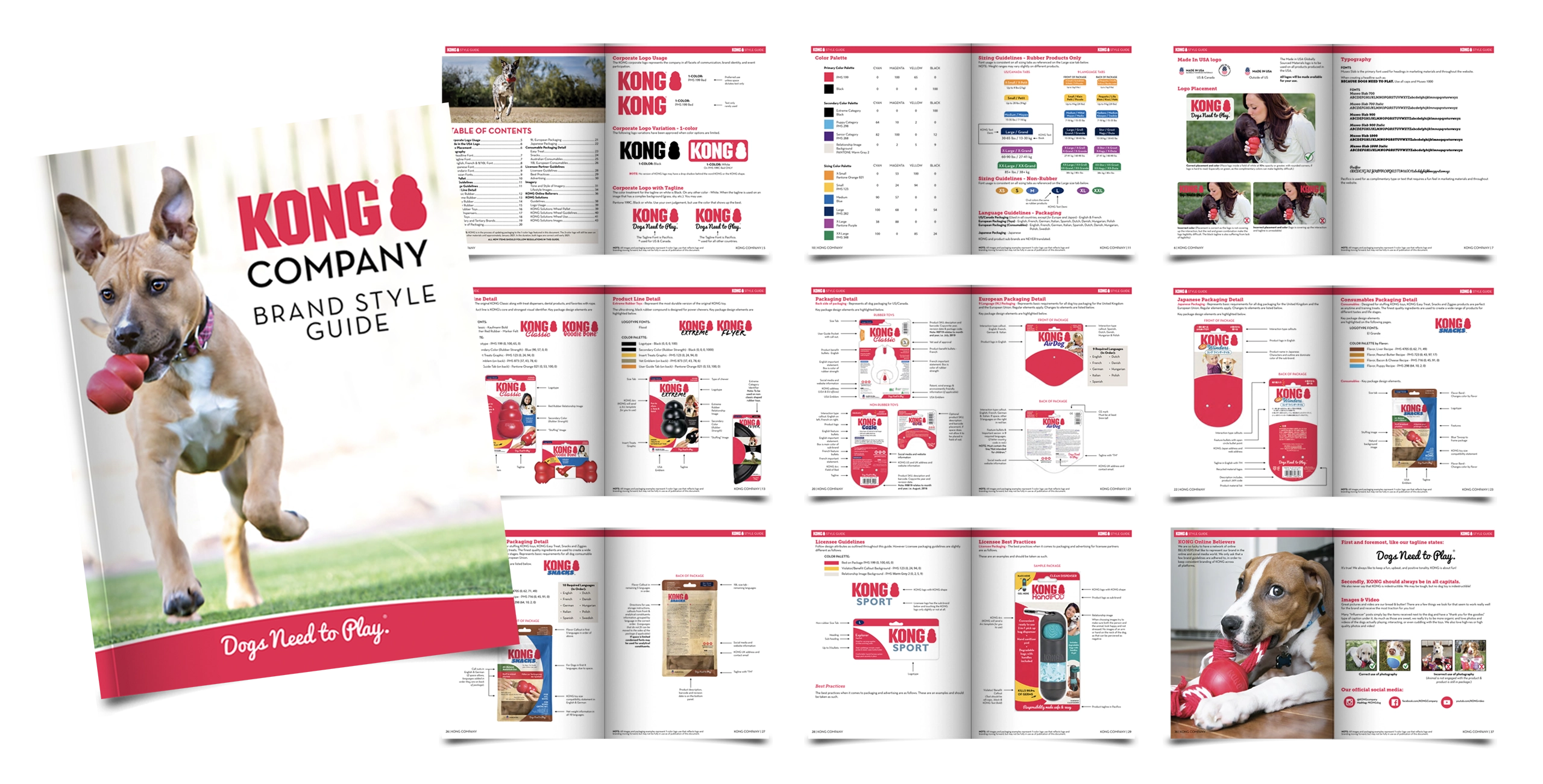
An important part of any brand is having a style guide that sets the rules for what is “on brand” and what is not. Over the years, as the brand has evolved, I have updated the KONG style guide many times.
In addition to logos, fonts and imagery use, the main topic of this style guide is packaging for the USA/Canada, UK/EU & Japanese markets, including licensee partners and their packaging. There are step by step pages showing all of the various options that are paramount in keeping the branding for the markets all over the world.


